This idea comes from a similar sort of game that baseball stat heads play. Â The idea is to match up similar athletes based upon their performances. Â In baseball, we’d look at a whole slew of statistics for some current player’s career and then scan through the historical records and find other players who had similar careers (at least, where they overlap in terms of age).
Obviously, there’s a whole heck of a lot more information floating around about baseball players than skiers, so we shouldn’t have very high expectations. Â But as I’ll demonstrate, we can actually create something that works ok.
First, the obvious stuff. Â I’m going to measure similarity in sprint and distance events separately. Â Most of my time getting this to work sensibly was spent trying different ways of measuring how “similar” two athletes’ results are. Â There are tons of ways to do this, but what I settled on works pretty well.
I’ll walk through the process using an example. Â Let’s take the Japanese skier Sumiko Yokoyama. Â She’s primarily done distance events, so we’ll only look for skiers who are similar in that respect. Â Why her? Â Well, no reason in particular, except that she’s had a long career with a bunch of races, so it’s a fairly easy case to start with.[1. Yeah, I’m making my method look good here. Â I’ll talk about when it doesn’t work in a bit.]
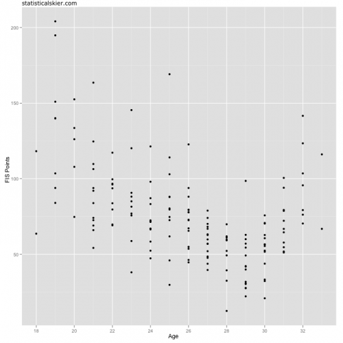
So here’s Yokoyama’s distance results from major international events (WC, OWG and WSC):
 I wasted a ton of time brainstorming all sorts of features of a skier’s career to include in my similarity measure: averaging things by season, counting the number of results at various levels, blah blah blah.
Waste of time.
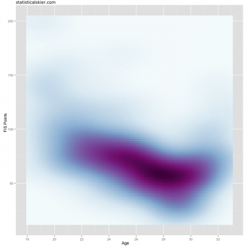
Instead, I decided to convert a skier’s result graph, as shown above, into a 2-d density estimate:
 Now, hopefully I haven’t lost too many of you already. Â Every single one of you has seen a graph like this. Â It’s called a topo map. Â So the colors are darker where the points in the first graph are denser.
Why do this? Â Well, this second plot is really just a matrix of values (like a topo map!). Â Each pixel has a number associated with it that tells us how dark to color that pixel. Â The topo map analogy would just be elevation. Â To compare two athletes, all I need to do is subtract their images from each other, pixel by pixel.
The beauty of this is that it automatically incorporates every single data point. Â Collapsing someone’s career down to arbitrarily defined variables will always miss stuff, and it’s just a headache.
The basic idea is to scan through athletes looking for skiers who’s 2-d density looks like the one above. Â Now, there are a lot of skiers around, and at the moment I haven’t put too much energy into coding this in a speedy fashion[2. Actually, calculating 2-d density estimates is just notoriously slow, no matter what you do. Â So it’s not entirely my fault.]. Â So I actually do a tiny bit of pruning of the potential candidates using some crude measures. Â Mainly I’m just tossing people who are really really different using a simpler, faster measure. Â This means I generally only need to scan through ~100-200 athletes instead of 1000.
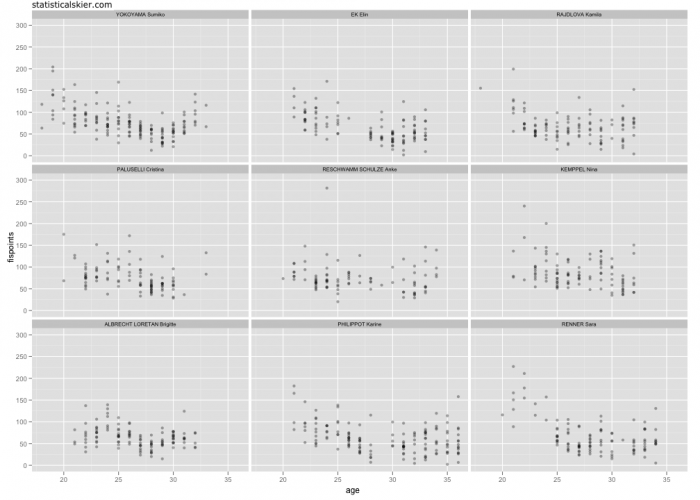
So let’s see how well this works. Â The graph below is the FIS points vs. age plots for Yokoyama and her eight “most similar” athletes, in no particular order (click through for larger version):
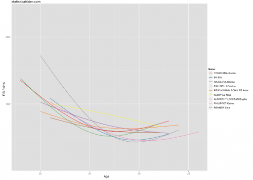
 Not bad, if you ask me. Â For a somewhat different look, here’s a single plot with a trend line for each athlete:
Neat!
Obviously, I’ve chosen an example skier with a long career and a ton of races. Â Finding athletes similar to, say, Liz Stephen, isn’t going to work nearly so well. Â Garbage in, garbage out, as they say[3. Liz Stephen isn’t garbage. Â Small data sets are garbage. Â You know what I mean.]. Â On the other hand, on a technical level, this method does work with small amounts of data. Â It will simply find athletes who are similar primarily over the portions of their careers where they overlap. Â So if you take a skier who’s got 3 years of results, my method will find skiers who had similar results during that age range.
Baseball geeks use this kind of stuff to make projections about player’s career: i.e. Joe Mauer is really similar to some collection of guys from the 1970’s or something, so he’s likely to have a similar career.
I don’t particularly have that level of confidence, to make those kinds of projections. Â But I’ll show you the results for various skiers in future posts, just cause I still think this is super cool.
[ad#AdSenseBanner]

{ 2 } Comments